


CITY HEALTH
Brand Identity and Strategy
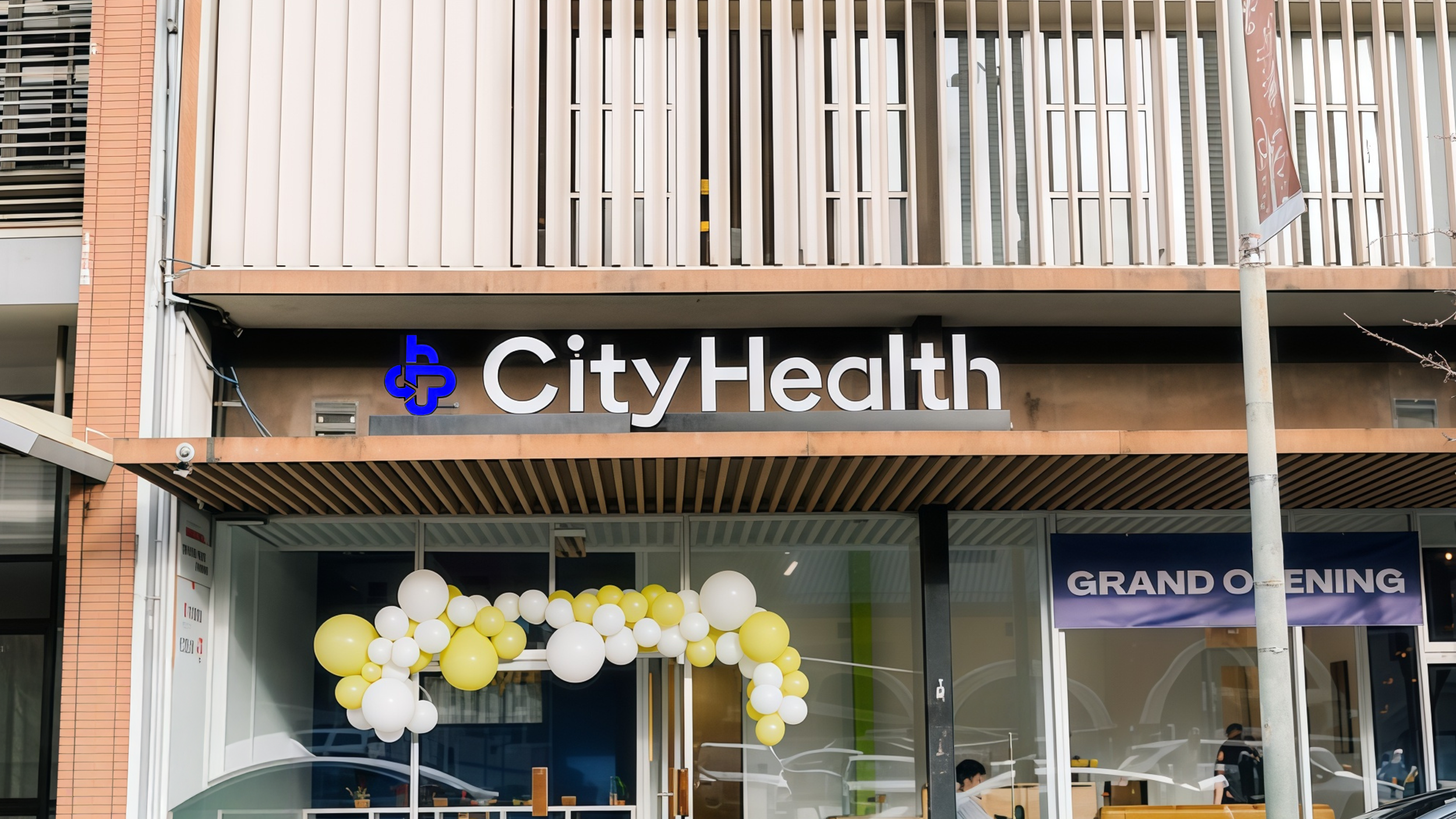
I rebranded CityHealth Urgent Care, a Bay Area urgent care provider focused on modernizing healthcare without compromising human care.
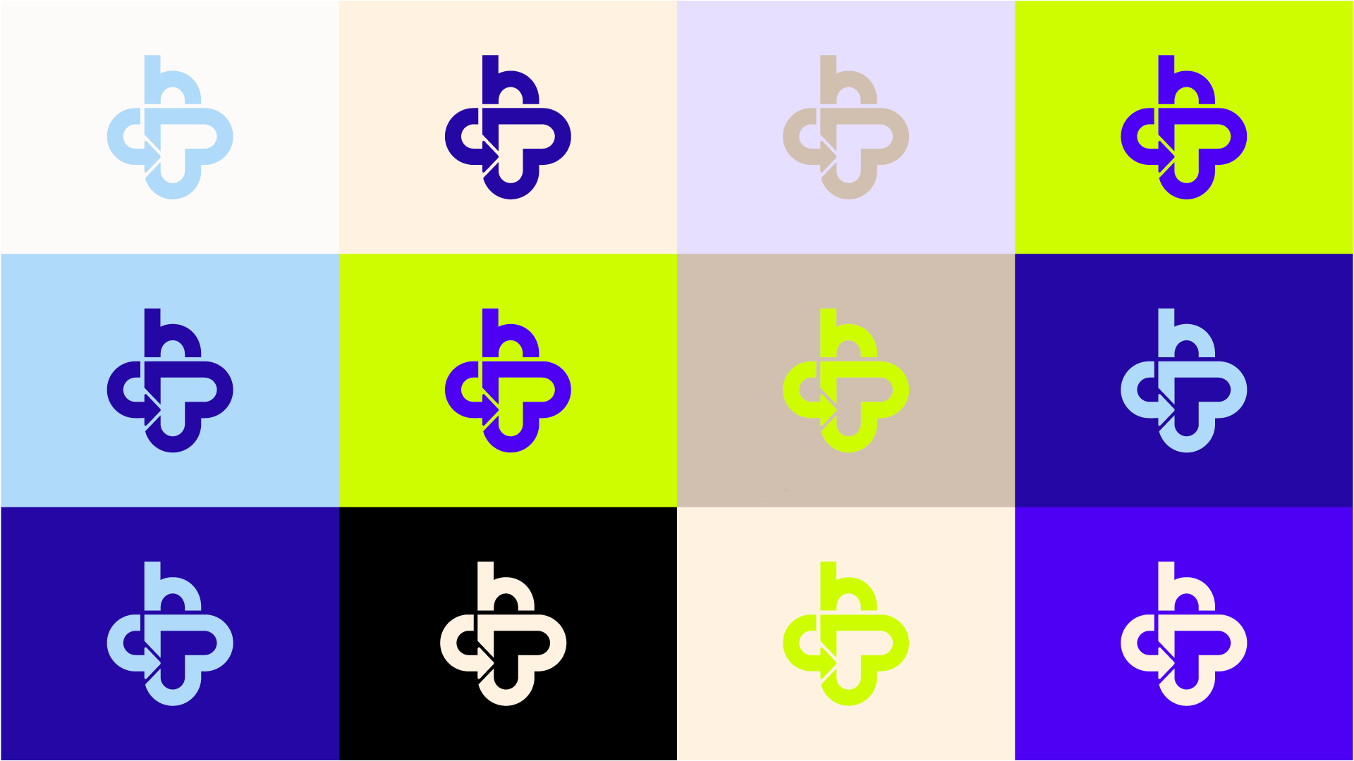
The goal was to make the brand approachable for younger generations while maintaining trust. The core idea was “Care Lives Here,” and we created a mark that visually reinforced this message.
The final monogram, built from the letters C and H, points inward to form a subtle heart shape, symbolizing care at the center.
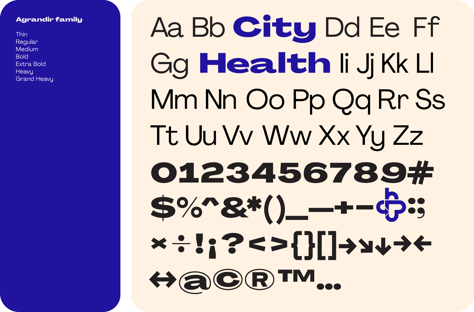
Balancing modern design with medical credibility was a challenge. Through studies of the mark and typography, we developed a system that felt contemporary and trustworthy.






ROLE: Brand Design
ART DIRECTION: Adriana Gonzalez